My role
- Lead Web Designer
- Information Architect
- User Experience Designer
Deliverables
- User research
- Site architecture
- Wireframes
- Mock-ups
- Design system
- Web development of all pages
- Design and art direction of all visual and user interface elements
- Copywriting
- Iconography
- Project management
Rebuilt with the users in central focus
Seattle Credit Union is Seattle’s first credit union. From back in 1933 until now they’ve grown every month to meet the needs of their members. As you can imagine, a financial institution with over 50,000 members, a billion dollars in assets, and approaching 90 years of history, they have a lot of different types of products and services to deliver on. That’s why we had to rebuild the website from scratch, starting with the very basics of information hierarchy.
The full site is a 520-page catalog covering every product, service, disclosure, and form a member would need, but the goal was to make it easy enough to navigate that it never feels overwhelming for the users. We used navigational groupings to combine similar products into their main categories based on the intent of each user, rather than the backend product department. Once the proper top-level navigational groups were established based on user interviews and card-sorts, we built logical subgroups off of those. The resulting site navigation led users down a funnel to the correct product or service they were looking for, before being introduced to rates, terms, or CTAs.
The team and I designed a series of custom icons, large images, and incorporated plenty of negative space to make each page easier to skim when browsing for a specific piece of information. I also designed new primary, secondary, and tertiary buttons, with the most important calls to action being the highest contrast elements on the page. The buttons also factor in several affordances to encourage interactivity. These affordances include lighting and shadow effects that lift buttons off of the page to draw attention, tasteful state changes for when buttons are hovered or focused on, and a concaving effect for when buttons are pressed or clicked so users get immediate feedback to their action.
This is the fourth generation of the corporate website that my team and I designed in my time working for Seattle Credit Union. In order to see how far the user experience of these sites has come, here are some snapshots from over the years. (2008 (the site design from when I was hired), 2011, 2014 which was the first responsive site for the credit union, and 2017.)
The project included merging three separate sites the credit union was using to fulfill its different needs from members:
The main corporate site, which was used to highlight products and services and ultimately help members and potential members open accounts and apply for loans. The knowledge-base, which was the “owner’s manual” for all credit union products, including nearly 250 articles on how to do everything from changing your online banking password to getting your tax documentation to report mortgage interest. And finally, the blog, which was a frequently updated site chock-full of lifestyle editorial, educational posts, and a hub for highlighting member and staff stories.
In addition to user interviews, we analyzed the site traffic going to the old website and brainstormed a logical group of top-level navigation items based on search queries and user flows. Once we had our top-level options, we designed a remote card sort (using Optimal Workshop) that involved members putting content in the areas they felt were most logical. After aggregating the insights, we were able to find a fitting home for all of the content. The final stage was having review sessions with single individuals and asked them to perform a series of basic actions, common amongst website users. More discoveries were made, and we further refined the site structure. With everything living under one roof, any page can be found through the navigation or using the robust search tool.
Want more? Ask me about the UX Playbook I developed for this project.
CMS: Drupal
Front-end Framework: Zurb Foundation
1
Distraction-free login
The website redesign was designed to get users to the page and section they’re looking for and making it easy for them to complete the desired action. One area where the old site was coming up short, was for the first-time shoppers. The log-in box placed right over the “hero” section that was intended to make a bold statement introducing them to the Seattle Credit Union brand. By moving the login box and replacing with a button we were able to clean up the elements on the homepage so it’s less distracting. The login section drops down when the button is clicked providing a distraction-free login experience. When members are entering sensitive information, the last thing they want is to be distracted with unrelated promotions or updates.
This update also allowed us to segment outgroups. Alerts related to upcoming online banking maintenance periods could be placed within the dropdown modal, rather than overlaying a bar on top of the homepage. Shoppers and browsers don’t need this information, but members who actively use online banking do. The goal of the site is to give people the information that is most relevant to their end goals.
2
Easy decision bar
When analyzing the user flows of the site visitors, we saw that it was often taking four or five clicks for users to get to a page where they could apply to open a financial product. This was bad for the user and for the financial institution. We add a “sticky” module dubbed the “Easy Decision Bar” that keeps the five main products (according to user data) one click away.
The icons grow when hovered, affording that it is a clickable element. The art for each icon makes the product offering easy to skim to help users absorb the content efficiently.
3
Subtle parallax effects
To keep users engaged as they scroll down the page, I broke up content with icons that reinforce the messaging of each section. Beyond the nice pop of color, and relief from endless blocks of text, the parallax effect applied to the graphics let catches the eye and makes the entire experience feel more interactive. Dialing in the effect was a bit of trial and error. Too little, you don’t notice and it’s bland. Too much, and it’s intolerable… kind of like salt.
4
Smooth testimonial sliders
Social proof is an important part of building trust towards a brand or product. Seattle Credit Union had so many great reviews from members in the form of emails to staff, hand-written notes, social media posts, and reviews on third-party sites. But that wasn’t doing them any good to the new visitors to their site, experiencing them for the first time. Each product and brand experience page features relevant testimonials from real members in a way that is fun to read through.
5
Dynamic content modules
A common complaint about the old site, promos and content would often feel stale quickly. One reason is that there was nothing to interact with on the homepage. Adding modules that can feature larger, bolder imagery; paired with a dynamic hover effect helps this section feel fresh and engaging to new and returning users alike.
6
Responsive calculators
There’s no way around the fact that some financial products are just harder to wrap your head around. With down payments, points, potential service fees, terms, principals and interest rates people get confused. And when people are confused, they can’t make a decision. I collaborated with a third-party team of developers to create custom product calculators for our consumer loan, mortgage, and deposit products; with me contributing the intended functionality of each calculator, custom icons and illustrations to ensure they felt cohesive with the site, and the front-end user interface layout. The result are fully responsive calculators the render beautifully and function across all major devices and browsers.
7
A better way to find branches and ATMs
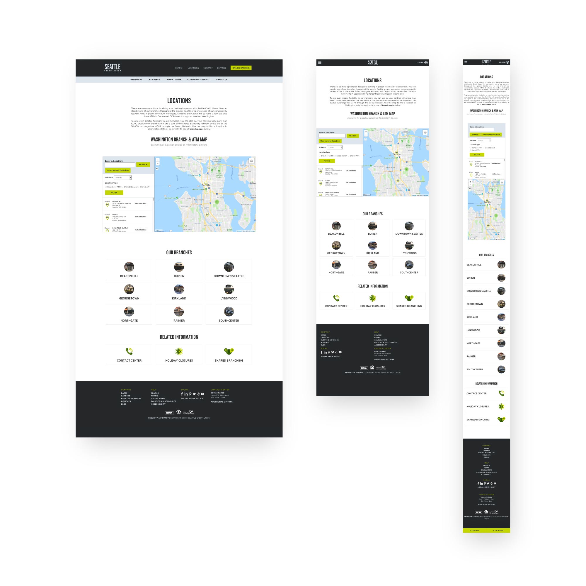
There are four types of locations that the credit union site visitors are typically looking for: their branches, their ATMs, surcharge-free branches, and surcharge-free ATMs. We developed a backend database that updates with all registered shared branch and ATMs in Washington state, along with all of Seattle Credit Union’s locations. Users can filter for what kind of location(s) they are looking for, and choose to enter their location or use their current location to find the options closest to them. When each result is clicked it will either zoom in to reveal that areas options, or offer details about hours of operation, address, and any special notes the user would potentially find helpful.
8
Friendly iconography
The credit union has a very long list of helpful services, and with new digital tools popping up constantly, the list size continues to grow. They needed a better way to highlight all of the services that are available just by being a member of the credit union, but nobody wanted to read through that endless tower of text. I illustrated and implemented nearly one hundred different icons for use throughout the site, to make this type of browsing easier for the member.
Accordions have been added throughout the site to make pages scannable, but when a user finds the section their looking for, details are readily available.
9
Engaging motion
The very nature of certain pages means that there will be an expanding list of content that will appear beneath the fold. But it’s great content! It should get to make a proper entrance. Images, icons, videos, and text blocks have all been customized to subtly enter the page, leading the viewer down the page and keeping enough negative space to where they don’t feel overwhelmed when reviewing individual sections. Before implementing site-wide, we did tests on a landing page series and notified the number of visitors that made their way down at least 75% of the page went up by over 30% using this approach.
My design process
The jumping off point for all of my work as a designer is to understand three things from the start. What are the goals for the business, for the user, and for the product. Without that, projects are missing a common thread between designer and stakeholder and the work won’t be as good as it could be.
With goals established, I aim to practice human-centered design as a creative approach to problem-solving. Everything begins with the person that I’m designing for and ends with solutions that are developed to meet their unique needs. It’s about building empathy for the actual people using the product and keeping them in central focus.
- Empathizing is putting myself in the shoes of the person I’m designing for and seeking to understand their circumstances as holistically as possible.
- Defining is the stage where I’ll develop personas, list challenges, pain points, and map out the decision trees for each user.
- Ideate is the stage where the team can throw out ideas in a collaborative way. All ideas are worthy, which is why “Yes and…” is a frequently used term in these brainstorming sessions.
- Prototyping is where I’ll put together mock-ups and see what works, quickly. I try to keep things simple and iterate on designs that show promise. Often times prototyping will naturally generate new (and better!) ideas, so I’ll step back to the ideation stage as needed.
- Testing is when the team and I will look at what we produced and really see if it works. We’ll test it and track the results. Find out if the design is accomplishing the goals defined in stage two. From there, we’ll iterate to make it better.
User focus groups
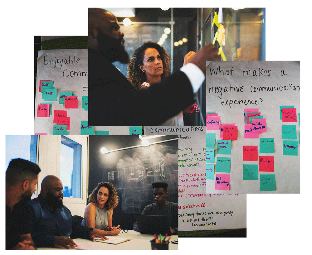
In order for us to properly assess what we were doing right in delivering a positive user experience to the credit union members, and where we needed to improve, it was important to conduct focus group sessions that gave us an opportunity to hear from them directly. We created a Member Focus Group that all members were invited to partake in via email, online banking messaging, on-hold waiting systems, and in-branch communications.
These sessions allowed us to assess user needs and feelings before we even started thinking about interface design. In our focus groups, we aimed to have roughly 9 participants, where we would discuss issues and concerns about the features of our digital tools like the website, the mobile app, and phone banking. The sessions typically lasted about 2 hours and were run by a moderator who maintains the group’s focus, while another team member would take notes.
These sessions brought out users’ instant and visceral reactions and ideas and let us observe some group dynamics and organizational issues. We asked people to discuss how they performed specific activities, their sentiment towards how that solution worked for them and asked them to give us characteristics of systems that were working well, and areas that were not. This information was invaluable in helping us better understand our user’s pain points, and tackle those problems with real empathy.
Personas
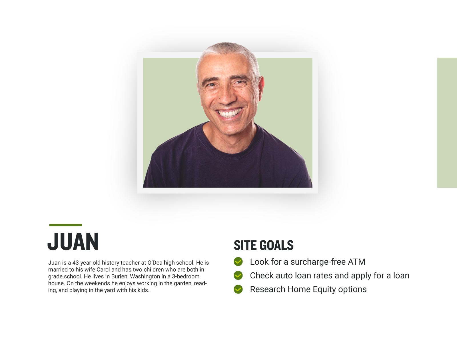
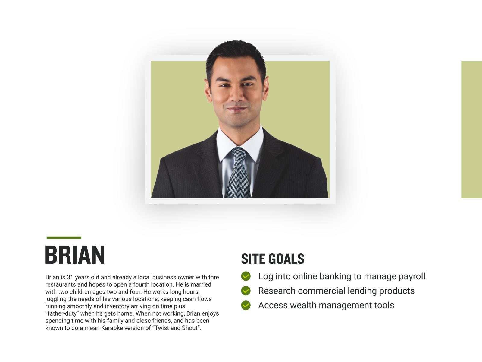
Understanding Seattle Credit Union’s website users was a fundamental first step to creating an exceptional product. In addition to the user focus groups, we also analyzed our website analytics from 2015-2018 to discover the most popular user-flows, and documented the most common search queries using the search console. We gathered demographic information and psychographic metrics including the affinity groups and in-market segments through Google insights. From this data, we worked with several departments to develop personas that encompassed the users of our site. This helped our team find the answer to the most important question, “Who are we designing for?” The personas made it possible to understand the expectations, concerns, and motivations of our target audience. (I have redacted all personal insights and detailed narratives specifically tied to member data for confidentiality with the client.) With these people in mind, we were able to better empathize with their experience and found opportunities to improve how we communicated information through our website. With four personas in total we found that although there were different factors to consider for each, it was possible to design a website that satisfies everyone’s needs and makes it easier to accomplish the common end-goals for each person.

Card sort & site map
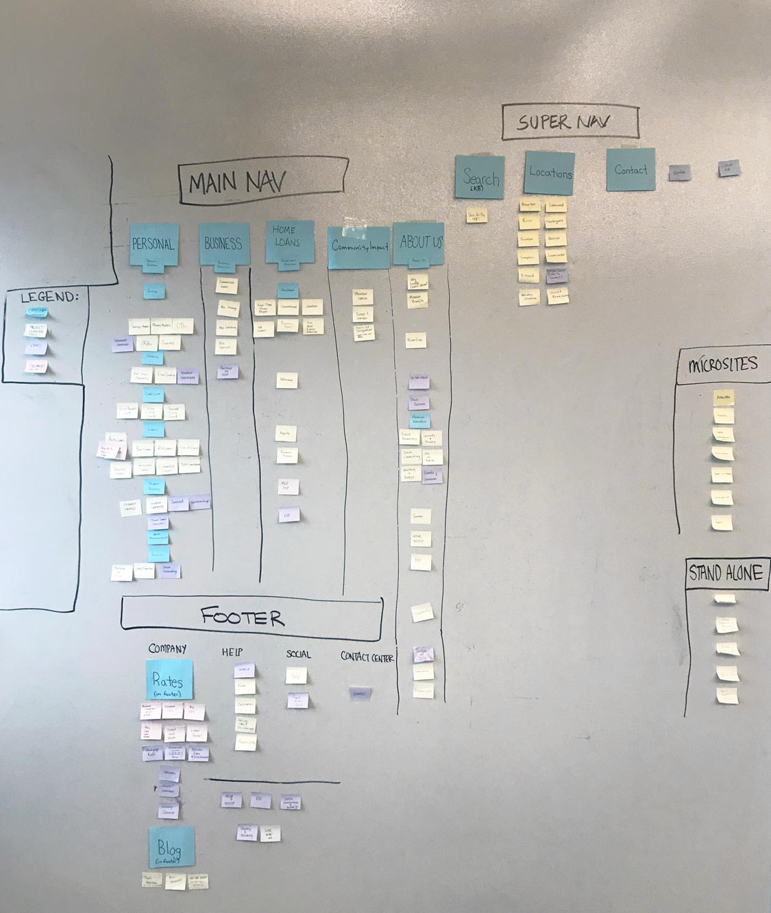
In order to deliver a logical and easy-to-use navigation, we needed to rethink the information hierarchy of the website. Seattle Credit Union offers literally hundreds of different products and services, and the average consumer is unlikely to know the ins and outs of each product category. To get our content into the appropriate buckets, we needed a system.
Open card sort: Our Marketing and Creative Services team had a few new employees at the time who did not have much experience with financial products, and a few of them mapped well to a couple of our personas. So we created sticky notes for every product and service and allowed the participants to sort these into groups they thought made sense, and allowed them to name each group. We went through a couple rounds of combining smaller groups until we felt that everything had a proper home under each parent section.
Closed card sort: To test our top-level groups, we then asked employees from other departments that don’t work directly with our products or website to help us categorize products under each group. From this, we were satisfied we had identified a good set of parent groups, but we also discovered that in some cases there were legitimately two top-level categories for certain products. Examples include Mortgage products living under its own umbrella called Home Loans, and also under Personal > Loans.
Site Map: Once all of the products and services had a place in our site hierarchy, our Marketing Product Manager and I rounded up all of the administrative and product-manual content that needed to be included in the site as well. This is content that is usually linked to in correspondences to members, but we also want it to live in a logical place so users can navigate to it and find it. This included things like the credit card agreement, electronic funds transfer agreements, and similar disclosure documents. We developed a new section in the footer called disclosures and created searchable articles that were tagged with the most common search phrases associated with these documents.
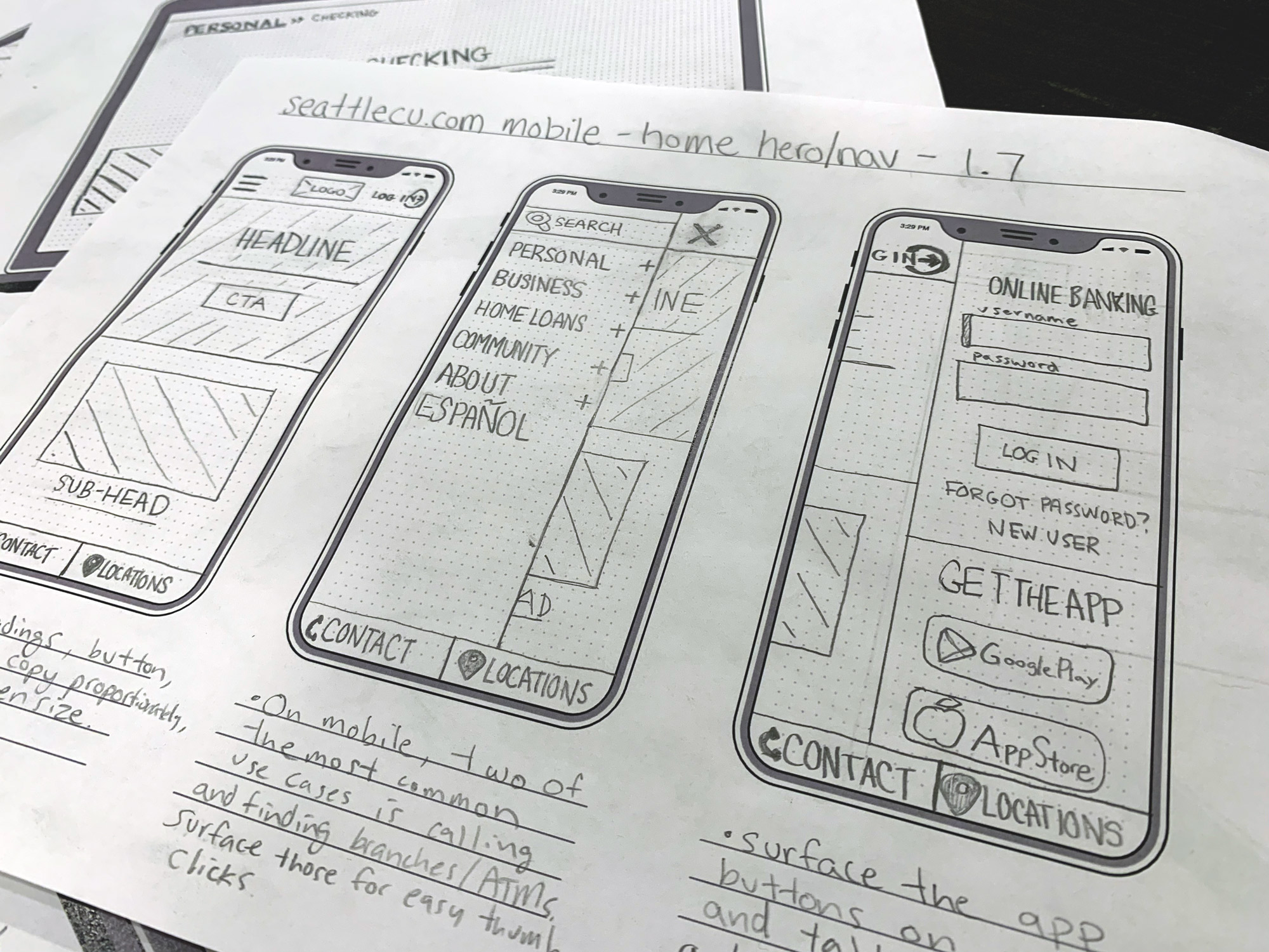
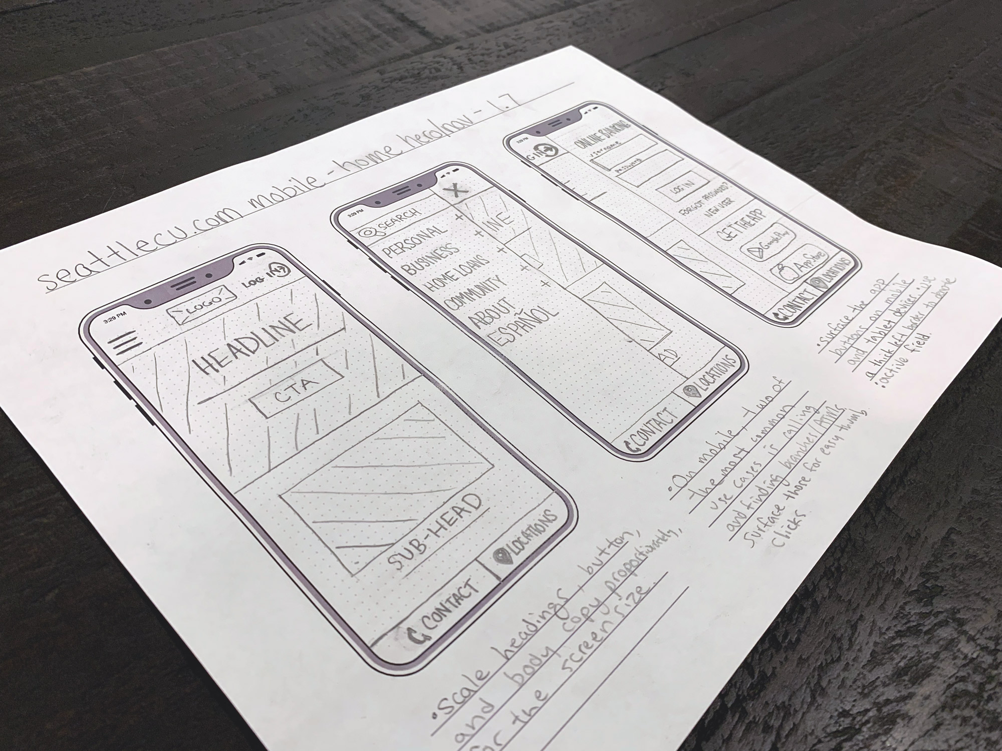
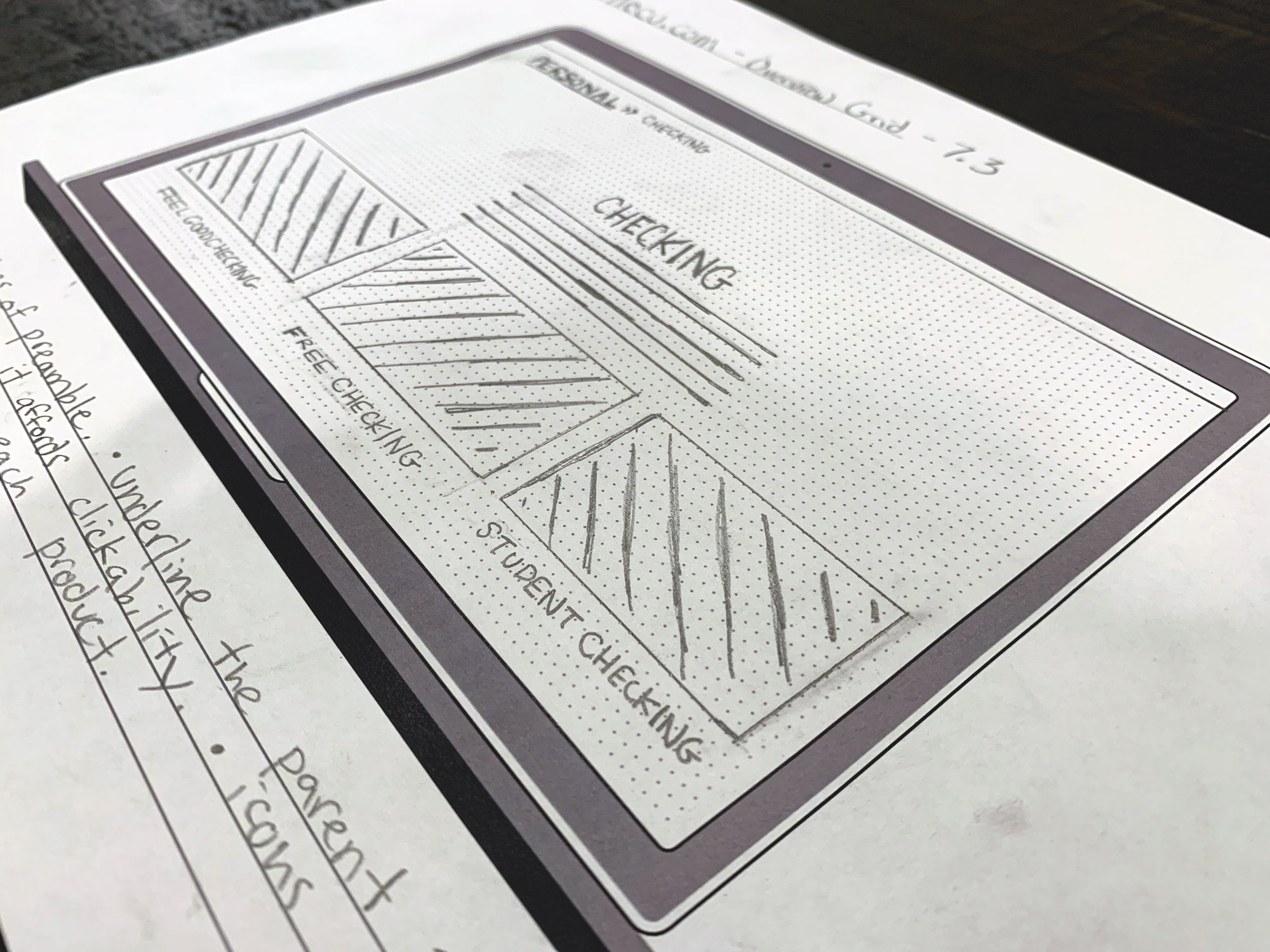
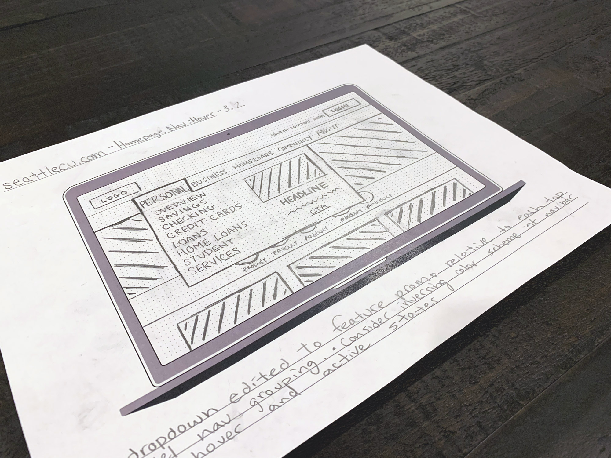
Low fidelity wireframes
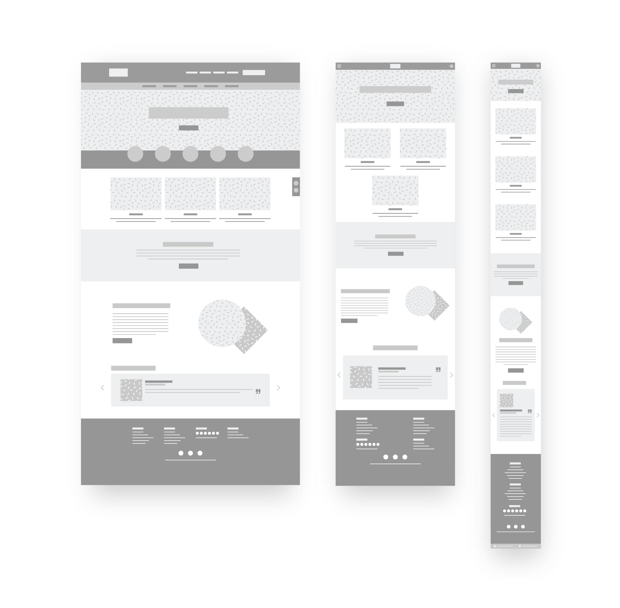
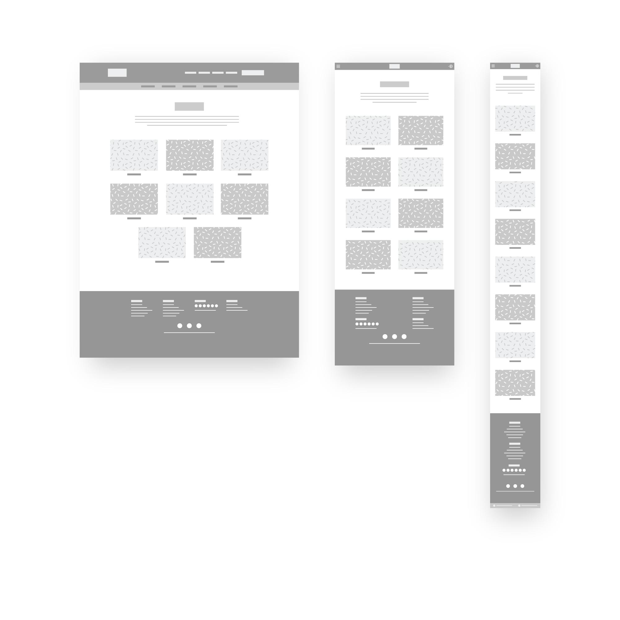
We developed a comprehensive catalog of wireframes accounting for all the various page types and device families. This helped help us think through the content structure before we started getting to granular on how UI elements should be styled. The wireframe process went through several rounds of edits, with members from outside of the website team reviewing and offering their feedback. These reviews informed content hierarchy, page structure, interaction insights that would eventually all contribute to how we would lay out our site’s pages and individual UI elements.
Leveraging the use of wireframes allowed the design phase to move in a more streamlined direction, as I wasn’t committing too deep to aesthetics until I knew we all had agreed to the overall structure. It also helped our team focus on strategy and usability first, and aesthetic second. These steps kept the user in central focus through every stage of the design process.
As a part of this project, I created a template for wireframing for mobile devices with specs similar to the iPhone X and another template for a MacBook Pro. It features a light gray dot-matrix grid to help with placement and balancing. It also features a title bar for organizing your wireframes and a notes section for capturing decisions, next steps, and insights.
Medium & high fidelity mock-ups
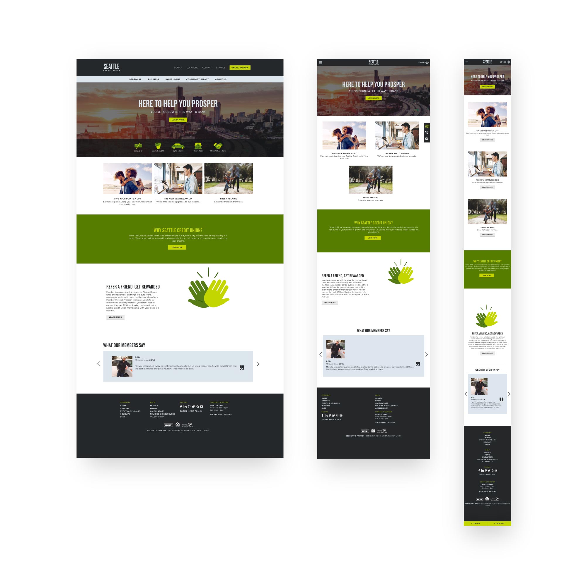
Once we had low-fidelity wireframes for the page templates we would need for the site, I created medium-fidelity mockups. I laid everything out in grayscale first and used basic shapes to denote images, icons, and rich media. The purpose for this was to focus on the content layout for desktop, tablet, and mobile dimensions without having stakeholders distracted by the actual content.
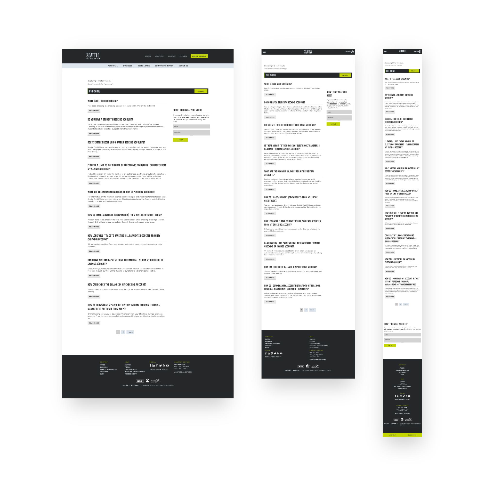
I met with each department head to review the medium-fidelity mockups and discussed how the content for their product line would be displayed on each device. After several rounds of feedback, we had stakeholder sign-off and I laid out the high-fidelity mockup for all five-page types.
In this stage, I used Adobe Illustrator and Adobe XD and then ended up switching to Figma.
Homepage
Drag slider to compare medium and high fidelity mock-ups.
Overview pages

Product pages


Search pages

Locations pages

UI colors
The colors in the palette reinforce the Pacific Northwest-vibe Seattle Credit Union is aiming to capture, but also delivers on the WCAG 2.0 AAA color contrast standards ensuring the site’s colors contribute to improved accessibility across desktop, tablet, and mobile screens. Fir and Volt were developed to be the hover and active states of the two dominant greens in the organization’s design system, Moss and Bolt. There’s an expanded palette featuring four more variants for when more tints were required to provide the level of detail for a given for certain components.
Moss
#567d15
Bolt
#c4d600
Fir
#375e09
Volt
#adc500


Reusable textures
As a part of the design system, I developed a series of textures that can be used for backgrounds, shapes, and photo accents throughout the credit union’s digital properties. The textures are scalable and tiled so implementation is quick and easy. This helps when working with multiple designers because the assets are readily available and proven to complement the rest of the site’s visual aesthetic.
Custom icons
In order to make content easily skim-able, we used icons a “anchors” for the eye. This helped give different blocks of content better context as to what it would be referring to. I also worked with a series of outside developers to create custom financial calculators and a location tool which both required its own set of UI controls for functions like “back”, “next”, “cancel”, “log in”, “favorite”, “print”, “dropdown”, and “roll up”. It was important to me to have even these small controls fit the personality of the brand, and matched the aesthetics of the product icons throughout the site. The result made these tools feel native to the site. For posterity and version control throughout the life of the website, I created a master document for all of these elements in one place.

Responsive scaling typography
The typographic scale used in any design is important for usability. A clear hierarchy of information needs to be established and maintained from section to section so a reader knows what elements are the most important and how details are related to larger themes. The site features a typographic scale based on the Golden Ratio. Font-size decreases when moving from the most important information, down through the related sections of information. H1 is the largest text, followed by H2, H3, H4, then block quotes, paragraph test, and finally, disclosure text being the smallest. The size of each of these elements is largest on desktop and laptop dimensions, but then scales as user’s devices decrease in screen-size. The smallest font sizes are used on mobile device dimensions, and tablet dimension font-sizes split the difference so the visual weight of each typographic element always feels appropriate related to the screen area.
In order to design and thoroughly test the typographic scale for the various breakpoints, I built a single-page site that uses media queries and scaling rules based on the golden ratio so you can see how content looks on any screen with any dimensions. It allows flexibility to quickly test out different font-families, text-decoration, and font-weight attributes, before committing to them. It also allows you to turn the scaling feature on and off as you change the dimensions of the browser window or testing across multiple devices. This helps you to really experience how these typographic choices will feel in the actual product.


