Client
iMatch
My role
  • User Experience Designer
  • Web Designer
  • Information Architect
Deliverables
  • User research
  • Site architecture
  • UX design mockups
  • Web development of all pages
  • Low-maintenance CMS solution
  • Updated brand visuals

Seattle’s boutique solution to staffing and recruiting needed a site as fresh as their service.

When iMatch approached me to redesign their site they stressed that their niche was in technology and finance professionals. Both of these segments are used to clean, modern user experiences that adapt to whatever device is handy.

I worked with various department stakeholders to sketch out user-flows, wireframe each page, and finally design and develop the website. Using a mobile-first approach each page was built to prioritize the most essential information into sections that render beautifully across mobile phones, tablets, and desktops, and supporting all browsers.

While adding fidelity to the website mockups I realized that the site also needed a refresh to their brand colors and some new custom illustrations they could use throughout their digital and social media channels. I worked on a new palette that complimented their rich red that clients had grown to recognize.

The final stages of this project included the implementation of a light content management system that allowed the client to make simple edits without having to perform large-scale updates typically associated with typical solutions like WordPress and Drupal. The site also incorporates a dynamic Career Portal powered by Bullhorn and PHP.

1

Hero splash page

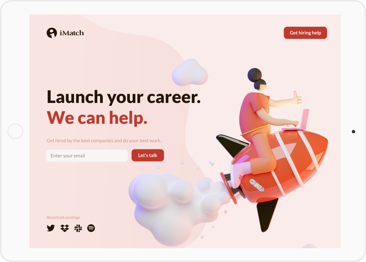
In talking to the stakeholders at iMatch including members of their sales and marketing team and users of their service I was able to gain insights as to how competitive this industry is. On the business side, one central need was a “marketing” splash page that drew attention and could be a good landing page for people to experience the brand, potentially for the first time. This is an area of the site that potential job-seekers and even some job posters would land through search advertisements or posts from social site sites like LinkedIn. It serves a separate function that the homepage, as it’s aimed to connect users to iMatch to start a conversation. As a UX designer, the goal was to remove all of the extra sales messaging and discussions of rates and procedures and focus solely on what a user would be trying to accomplish on this page.

On the user side, I put myself in their position. If you were scrolling through LinkedIn and saw some interesting career-related content and thought it was worthy enough of the click to give iMatch a shot at connecting you to some job openings, the last thing you want is to then have to endlessly scroll or sift through a bunch of navigation and sales jargon. We simplified the call to action for job-seekers to just one, collecting the email address so iMatch can show what they do best, and that is personalized recruiting services.

For job posters, they have the option of entering their email, or they can be directed to a page on imatch.com where they can submit openings for review or contact their representative if a relationship already exists.

2

Dynamic, lightweight hero image slider

iMatch wanted to balance their business objectives as they are both a recruiting service and a staffing agency. To give both lines of business proper representation, I built a lightweight, dynamic hero image slider. This allows for multiple messages to share “center-stage” on their homepage. After 5 seconds, the hero image is swapped out with an updated image. A subtle light-gray line tracks along the baseline of the image to give the user an indication that a countdown is occurring.

3

Easy-to-update job modules

Reviewing iMatch’s old site, I saw that it relied too heavily on long lists of possible job openings. I wanted to break these out into easily skimmable blocks of content. Each job type is reinforced with an icon to let the user know what field the job posting is associated with.

Keeping content fresh and eye-catching was another important consideration for the site. I developed a series of banners that can be applied to any job module. They read “New”, “Hot”, and “Look” and draw attention to special jobs that the client wants to highlight at any given time.

4

Illustrations and icons

Icons, photos, and blocks of copy animate onto the viewport to keep users engaged with the content. Other elements like testimonials dynamically populate to provide social proof to the user and build trust which helps move them down the conversion funnel.

Each page features a different custom illustration to break up the content and give the user a visual cue about what kind of content will be featured in the sections.

5

Friendly faces, easy connections

It’s all about consistency, even in the headshots. I organized a photo-shoot and edited the photos for the iMatch team to give the website a consistent look and feel. The team section features easily customizable blocks of content for the various ways each member would like to be available. Most default to email and LinkedIn, but they also have the ability to add Twitter, Facebook, or their phone number.

6

Secure contact form and map

I built a secure contact form tied to a simple database. Users enter their information and receive an automated email thanking them for their inquiry and informing them they will hear back soon. In the event that a new user’s email gets lost in the shuffle, (it happens to the best of us) the client can export entries for any period of time and follow-up with their new leads.

The map makes it easy for users to locate iMatch’s physical location and pull up directions on any devices that they’re using.

7

Career portal

I redesigned the iMatch career portal to improve usability and make it easier for job seekers to find the right positions. The portal allows users to easily search, sort, and review job openings based on a number of factors. Users can also share job postings on their social channels and with their email contacts, as well as view similar jobs that might match their criteria. When a user finds a match, they can complete the simplified application form and submit their resume all through the portal.

Buttons are disabled until users have completed the requisite form fields with valid entries. Informative inline error messages populate throughout the form fields to help users through the funnel towards a completed job submission.

Watch the video to the right to follow a user through the flow of searching and filtering for an Accountant job, reviewing the job descriptions of posts, then exploring the related openings, and ultimately applying for a job that best matches their skill set through the form.

Empathy maps

In order to design a website and career portal that solved user needs, I along with the project stakeholders had to really understand what those needs were. After conducting several empathy interviews with existing iMatch clients and users of similar job finding sites, where I asked open-ended questions about the way they used the job search tools they were familiar with. As we’d navigate through these tools, I’d ask questions like, “how does this message make you feel?” and “what do you like or dislike about this process?” From these interviews, I had a collection of qualitative information about how the users interact with these tools.

I chose to use an empathy map to help align my efforts with the stakeholders so we could visualize what our user’s needs were and decide how to prioritize them. An empathy map is a collaborative visualization that’s used to articulate what we know about a particular type of user by focusing on what they say, think, do, and feel. In this case, we focused on job-seekers in the financial space, as that is a core user group. We did a similar exercise with the technical recruiters as well. These steps helped to externalize knowledge about users to create a shared understanding of the problems we were solving and made reaching consensus as a stakeholder group easier.

Personas

To meet the needs for iMatch, I needed to better understand who they were trying to serve. I worked with the Managing Director to break down their typical clients and what industries they came from. iMatch has a personalized approach to recruiting/staffing and the staff prides itself on being able to fill a broad array of talent requests, but ultimately their clients break out into two high-level segments: people who need talent, and talent who want a new job. The bulk of their clients in both of these segments are in the Information Technology and Finance industries. The reps at iMatch were able to describe a few of their recurring clients in great detail, and from that, we were able to put together personas that represented who they were targeting currently and who they wanted to start attracting and servicing through their website. The personas we came up with helped me to identify who I was designing for. I had a better sense of what goals they were trying to accomplish; what state of mind they were in when using the site; and ultimately, what information they need to take the desired action.

Site map

I worked iMatch to understand what information the users of the site needed and also hypothesized on what content would help tell iMatch’s story. After a few rounds of adding top-level sections and then combining some of the more granular breakdowns, we landed on five top-level sections that would ultimately appear as the main navigation throughout the site: Find Work, Find People, Our Process, Our Team, and Contact. Each section led down their respective decision funnels for the user.

Wireframes & mock-ups

I developed wireframes to provide clarity on how each page-type would be structured. I used only neutral grays for the color to keep all of the stakeholders focused on content, scale, and visual hierarchy knowing that colors would be a consideration for the mock-up and development phases of this project. For navigation, I only included text for items where we had sign-off on verbiage and added placeholder text to give the team a sense of how content would flow on each page.

After a round of edits to the wireframes, we had a consensus and I mocked up the key pages that could serve as the templates for all others. These were the Home, Find work, Our Team, and Contact pages.

Homepage

Drag slider to compare medium and high-fidelity mock-ups.

imatch homepage wireframe imatch homepage mockup

Find Work page

imatch find work wireframe imatch find work page

Our Team page

imatch our team wireframe imatch our team mockup

Contact page

imatch contact wireframe imatch contact mockup

UI colors

The main red from iMatch’s brand, dubbed “Recruiter Red” needs an earthy clay color to give the palette a human element. iMatch is all about human-to-human connection. Their recruiters have a very hands-on approach with their clients, and the various shades and tints of this clay color reinforce the idea that the process will be organic and personalized. Hired Maroon is used on buttons and links to give just enough user feedback when clicking elements throughout the site.

Recruiter Red

#c0392c

Hired Maroon

#9c1710

Clay

#e9e6e1

Results

All values measured year-over-year from the previous year’s activity compared to the first year of the new site being launched.

417

Increase in average time on site.

32

Decrease in bounce rate.

24

Increase in leads from website.